The 2026 World Cup away jerseys are arriving thick and fast, and the range in quality is extraordinary — from genuine works of art to shirts that look like they were designed on a lunch break.
Away kits always carry more license than home shirts, which tend to be conservative by nature. This summer's batch proves some suppliers seized that freedom. Others squandered it completely.
The ones that actually work
Start with Belgium. adidas have produced something genuinely special here — a nod to surrealist artist René Magritte, complete with the quote "Ceci n'est pas un maillot" ("This is not a jersey") printed beneath the collar, referencing Magritte's "The Treachery of Images." It's clever, layered, and will absolutely be a hipster's favourite. Belgium's golden generation is long gone; at least the kit signals a new identity.
Argentina's away is a departure from their usual conservatism. A black base threaded with foliage swirls in various shades of blue, reportedly drawn from Buenos Aires's Fileteado Porteño folk art tradition. It's bold for a nation that usually plays it safe on the kit front. If they're chasing history — becoming the first back-to-back champions since Brazil in 1962 — at least they'll look the part while doing it.
Japan simply understand what they're doing. Eleven coloured stripes running vertically, each representing a player, with a central red stripe for the wider football family. The baseball pinstripe reference is earned, not forced. Understated brilliance.
Scotland are back at the World Cup for the first time in 28 years, and adidas have delivered a modern regeneration of a vintage classic. The Tartan Army will look genuinely dashing. For a side whose qualification alone was cause for national celebration, the kit matches the moment.
Austria's marbled mint-green effort from Puma is one of the tournament's genuine surprises — geometric gold lines over a design that captures both alpine terrain and art deco architecture. It works far better than it should on paper.
- Ghana — Puma's Kente cloth-inspired yellow is bold enough to be spotted from orbit. The Black Star sits centre stage. Ghanaians will love it.
- Mexico — adidas again. The red and green collar and sleeve trim lifts what could've been ordinary into something that'll shift serious merchandise units across North America.
- Colombia — adidas deliver a jersey destined for summer festivals worldwide, regardless of what happens on the pitch.
- Curaçao — Their World Cup debut deserves this kit. Pastel yellow with vibrant sleeve detailing, paying tribute to Willemstad's colourful capital. It will sell out.
- Wales — Welsh dragon designs dominating a cream body, with alternating red and green adidas stripes. The Welsh FA called it a "masterpiece of football design." Hard to argue.
The ones that missed badly
Switzerland have produced something that looks genuinely confused about whether it's a bib or a training top. Puma owe the Swiss public an explanation.
Egypt's effort isn't much better. Puma dropped some pyramid imagery on the chest and called it cultural homage. It isn't. It's a dull shirt that does nothing with one of football's richest national stories.
Australia went futuristic and landed somewhere unpleasant. The Netherlands had something similar in approach — a strong base undercut by an awkwardly thick horizontal chest stripe that simply doesn't belong there. Nike's Oranje collaboration had real potential and stumbled on the execution.
Turkey's white away shirt suffers from overcrowding at the top and emptiness everywhere else. Too many design elements crammed together where there's no room for them.
Then there's Brazil — their Jordan Brand collaboration, the American label's first appearance on the World Cup stage, uses Amazonian dart frog inspiration on a blue alternate. Blue has been Brazil's alternate colour for decades, but this is unlike anything they've worn before. Reaction will be split. That's probably the point.
France in turquoise — Nike are calling it "igloo/monarch" — is a deliberate break from white, supposedly a tribute to the Statue of Liberty. Whether French supporters buy into the symbolism is another matter entirely. The absence of the tricolor will irritate traditionalists.
England go back to red, the colour worn in the '66 final, with a gold star above the Three Lions crest. Harry Kane lifting the trophy in New Jersey remains the dream. The shirt, at least, is sorted.
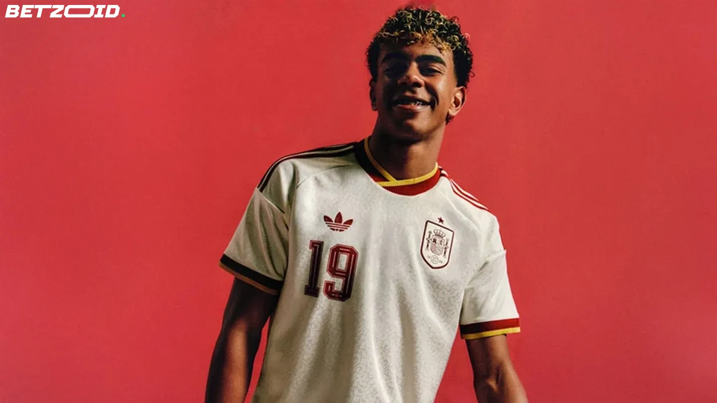
Germany's away, described by Liverpool's Florian Wirtz as "unusual, but really good," draws inspiration from vintage training attire. It'll be adidas' final major collaboration with Die Mannschaft before Nike take over next year — and it's a fitting farewell, landing somewhere between nostalgic and genuinely cool.
Across 40-plus confirmed and leaked shirts, the gap between supplier ambition and supplier execution has never been more visible. adidas are leading this tournament's kit conversation by a distance. Puma are inconsistent. Nike are frustratingly hit-and-miss. And somewhere, a Switzerland designer is hoping nobody zooms in too closely.